
01 / PROBLEM STATEMENT
As part of a 30-day design challenge focused on rapid brand strategy and visual identity creation, the prompt tasked me with designing a fresh, creative, and playful brand identity for Yoko, an ice cream shop.
The primary challenge was moving away from traditional, generic dessert branding to build an identity that feels genuinely fun, energetic, and expressive—all within a tight design sprint. The brand needed to capture pure optimism ("a scoop of joy in every bite") while maintaining a cohesive, professional aesthetic across packaging, digital touchpoints, and physical products.
02 / DESIGN SOLUTION
The design solution for Yoko Ice Cream Shop bridges the gap between modern design and playful nostalgia by introducing a cohesive visual identity built around optimistic storytelling. To capture a high-energy and creative feel within a 30-day sprint, the brand relies on a custom, hand-drawn script logotype paired with a bold, high-contrast primary palette of deep green and sun-kissed yellow . At the core of the identity is the Smiling Drippy Scoop mascot system—a friendly visual character that transforms melting ice cream into an expressive personality. This mascot adapts across flavor-specific colorways, creating a lively narrative framework that unifies the entire product lineup while ensuring each flavor feels distinct.
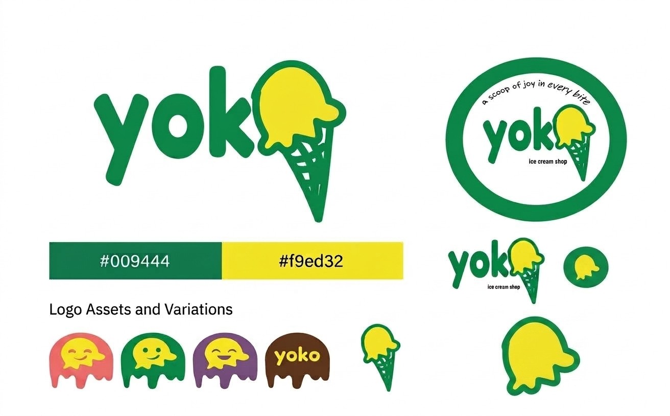
To ensure versatility across both digital touchpoints and physical packaging, the identity incorporates a flexible modular system of secondary marks and clear guideline specifications. A circular badge seal featuring the tagline *"a scoop of joy in every bite"* was engineered specifically for compact applications such as tub lids, stickers, and uniform embroidery. By combining rigorous color standards with playful character variations, the Yoko brand identity provides a scalable, retail-ready toolkit that stands out in a crowded dessert market.
03 / APPLICATION
The application phase translates Yoko’s visual identity system from foundational brand guidelines into vibrant, real-world consumer touchpoints. By extending the high-contrast color palette, custom wordmark, and playful mascot system across single-serve paper cups, retail ice cream tubs, and custom-printed waffle cone wrappers, the packaging architecture ensures seamless brand recognition at every stage of the customer experience. From high-visibility in-store serving vessels to color-coded takeaway tubs that distinguish flavor profiles, each touchpoint is engineered to deliver a cohesive, tactile, and high-energy brand presentation.
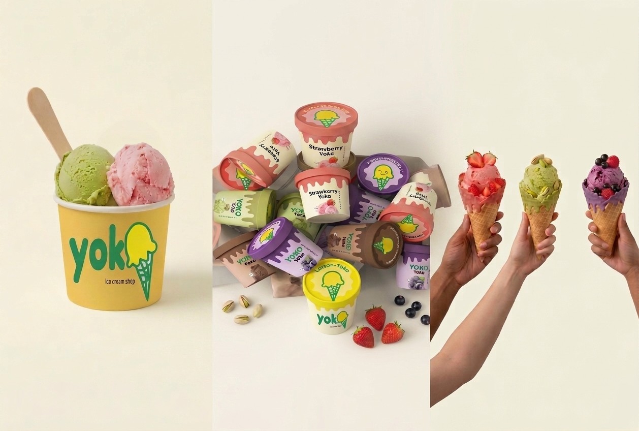
By blending vibrant nostalgia with a modern, modular design framework, the Yoko Ice Cream Shop brand identity successfully transforms everyday dessert packaging into an engaging consumer experience. From its custom hand-drawn wordmark and expressive "Smiling Drippy Scoop" mascot system to its flexible, color-coded packaging architecture, every visual element is engineered for high energy, instant recognition, and seamless scalability. Ultimately, Yoko demonstrates how a cohesive brand strategy can bridge digital presentation and tactile retail touchpoints, delivering on its core promise to bring a genuine "scoop of joy" to every customer interaction.