02 / CASE STUDY

What is Dyslexia ?
Dyslexia is a brain-based learning difference that primarily affects reading , spelling and writing . It is associated with differences in how the brain processes written language and is not a problem with vision or intelligence. Dyslexia is lifelong, although its impact can change over time and with appropriate support.
The rise of dyslexia-friendly fonts
In 1927, neuropsychiatrist Samuel Orton observed that many of his young patients with reading difficulties reversed similar letters, confusing d for b. This fueled early speculation that dyslexia was a visual disorder that caused printed letters to appear as a confused, jumbled mess. As a result, in the last decade, typographic fonts such as OpenDyslexic have been designed to alleviate the reading difficulties associated with dyslexia. The simple, classroom-friendly intervention claims to improve the speed and accuracy of dyslexic readers by adjusting the size and shape of fonts, adding thicker lines to help students distinguish between similar letters. The designers of these fonts claim that the heaviness of the letters prevents them from flipping upside-down or left-to-right.
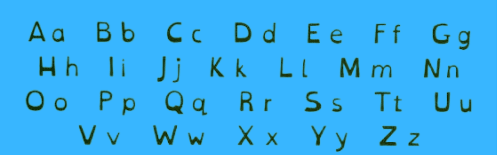
The assumption that dyslexia is a visual problem rooted in imprecise letter recognition is, in fact, a myth. Contrary to popular belief, the core issue in dyslexia is not letter reversal — although it can be an indicator. Rather, the difficulty lies in identifying the discrete units of sound that make up words, and matching those sounds to the letters and combinations of letters required to read or write.
In a 2017 study, researchers tested whether OpenDyslexic — a popular font featuring thicker lines — could improve the reading rate and accuracy of children with dyslexia. Comparing it against two other fonts designed for legibility, Arial and Times New Roman, they found that the purportedly dyslexia-friendly font actually reduced reading speed and accuracy. In addition, none of the students preferred reading in OpenDyslexic. A similar pattern emerged in a 2018 study on Dyslexie, another popular dyslexia font, which found no benefit to reading accuracy or speed compared to Arial and Times New Roman — with children again expressing a preference for the mainstream fonts.These fonts may also give children false hope, which can be especially harmful for those who have already experienced significant academic struggle and stigmatization related to learning to read. When these children find that a font "designed to work for them" doesn't actually improve their reading, they may conclude that the problem lies with their own inability — not with the font. With this, it begs the question: if specialized fonts don't improve reading outcomes — and may even cause harm — what actually supports readability for people with dyslexia?
What actually supports readability for people with dyslexia?
Experts at the British Dyslexia Association highlight that fonts do matter, and this is because they matter for all readers — adopting best practices for dyslexic readers has the advantage of making all written communication easier for everyone. They recommend fonts designed for general legibility, such as Arial, with font sizes between 12 and 14 points, and the use of section headings to create consistent structure within documents, easing navigation. Typography, however, is only one part of the puzzle. The International Dyslexia Association recommends a multisensory, structured language approach that systematically integrates several senses — hearing, seeing, and touching — while the child is learning to read. Classroom accommodations such as audiobooks, note-taking apps and text-to-speech software can also help students with dyslexia feel supported and accepted. Tasks that appear simple to most students may take extra time for those with dyslexia, so it's important to provide tools that take into account their unique processing challenges, allowing them to demonstrate content understanding and access the curriculum with greater ease.
To illustrate this, I designed Bloom Academy, a reading companion tool built on one central premise: readability is a system, not a typeface. Rather than relying on a single visual tweak, Bloom Academy combines customizable typography, clear structural chunking, screen contrast controls, and multisensory features like "Read Aloud" and word highlighting. Operating seamlessly alongside existing curricula, it moves accessibility beyond mere visual adjustment into an adaptable learning environment.

Ultimately, this case study set out to answer a core UX question: how can designers genuinely support readability for readers with dyslexia? The answer was never going to be a quick-fix font. Specialized typefaces like OpenDyslexic or Dyslexie show no empirical improvement in reading speed or comprehension—and over-relying on them risks alienating young learners with unfamiliar visual aesthetics.
True accessibility requires a holistic ecosystem. By combining legible and adjustable typography, consistent interface structure, and integrated multisensory tools, Bloom Academy serves as proof that designing for dyslexia isn't about finding a magic font—it's about engineering an experience where every layer works together to empower the reader.